Namita — branding, naming, and visual identity design
intro / concept
branding and packaging design
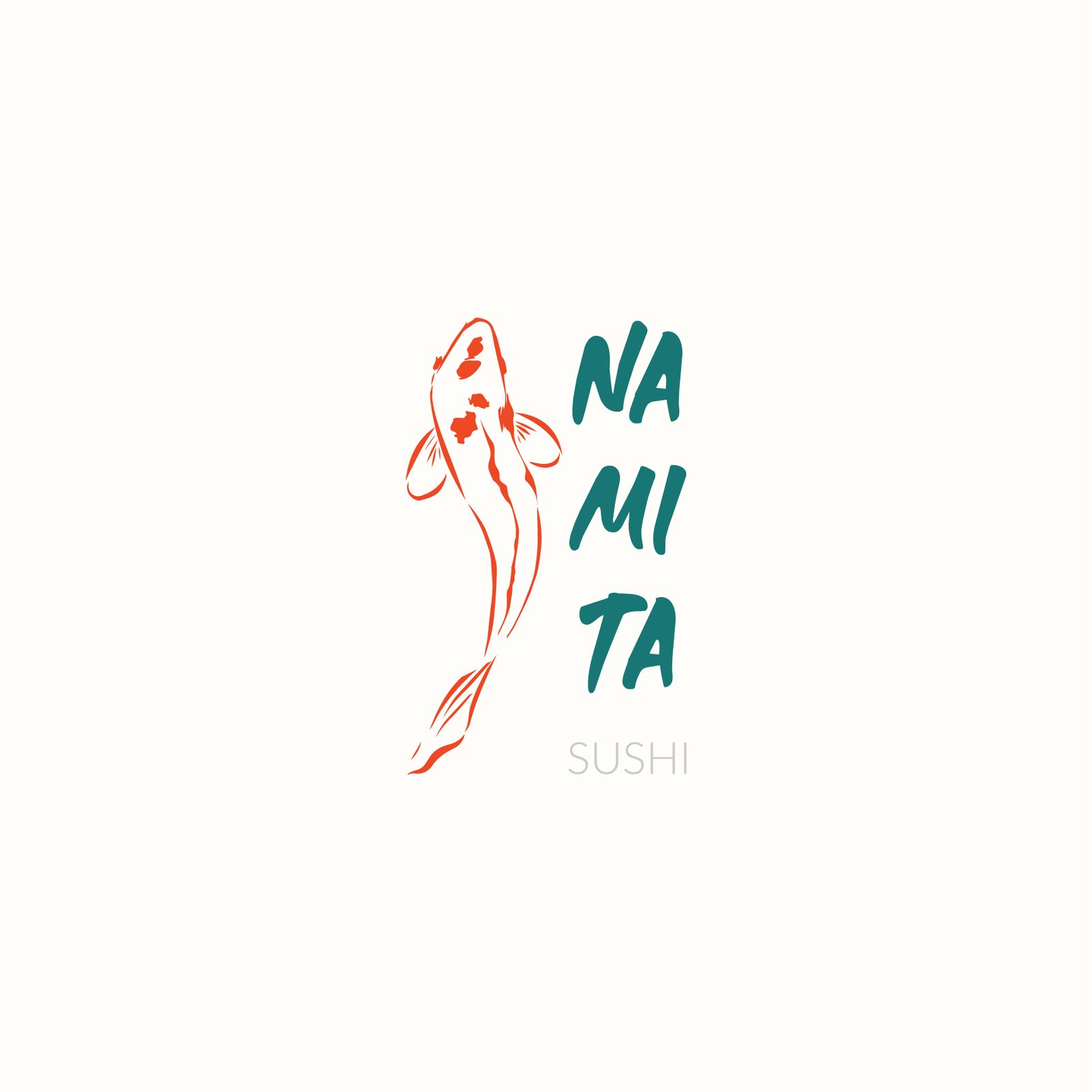
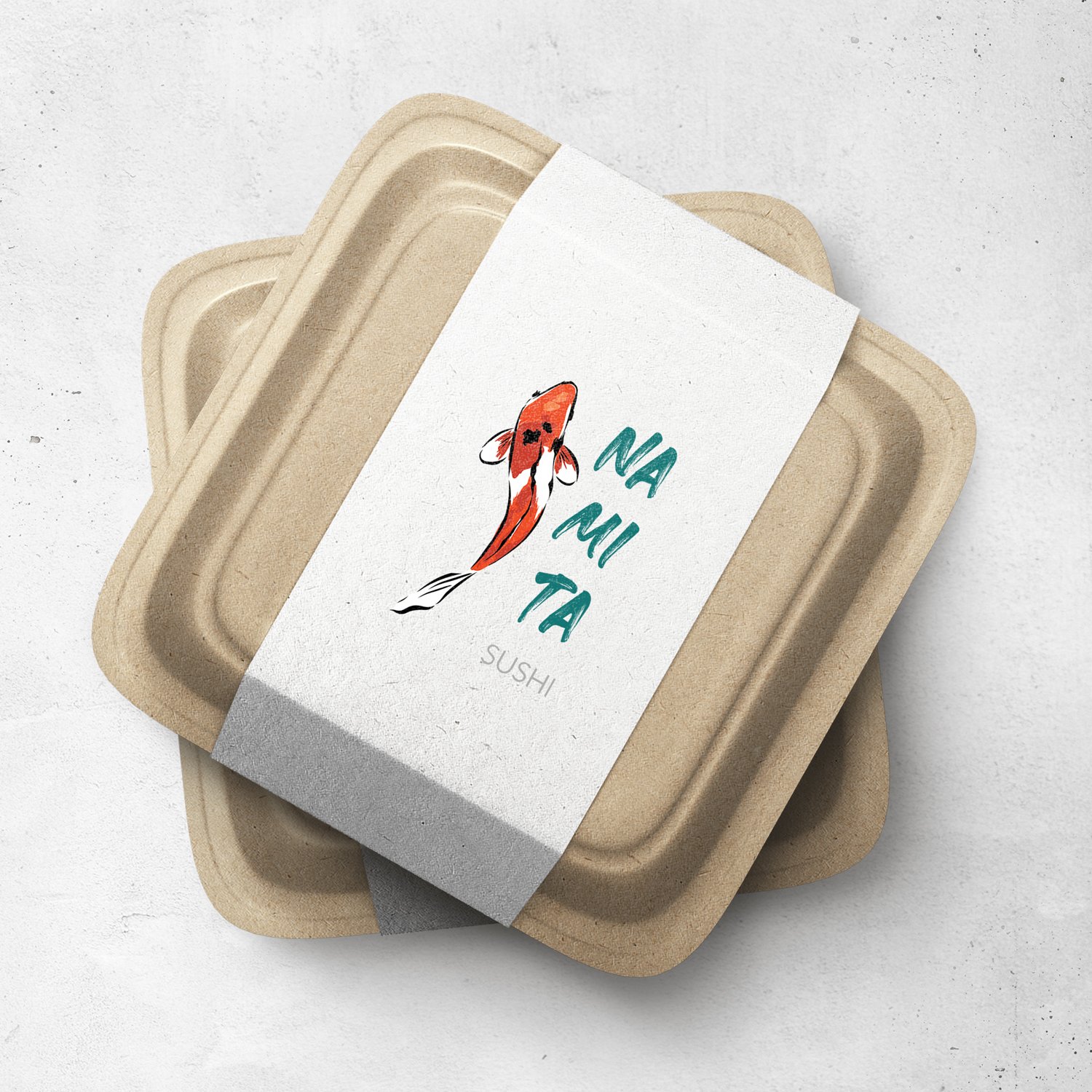
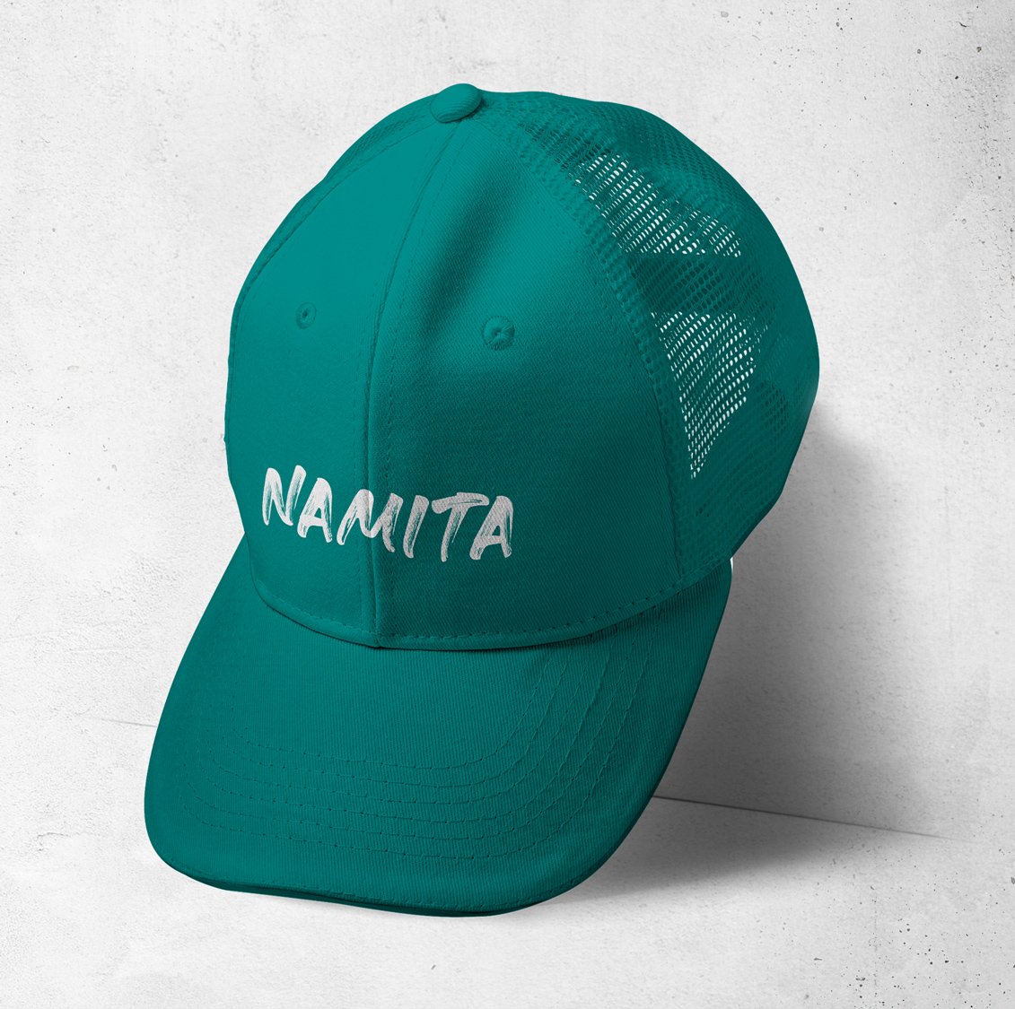
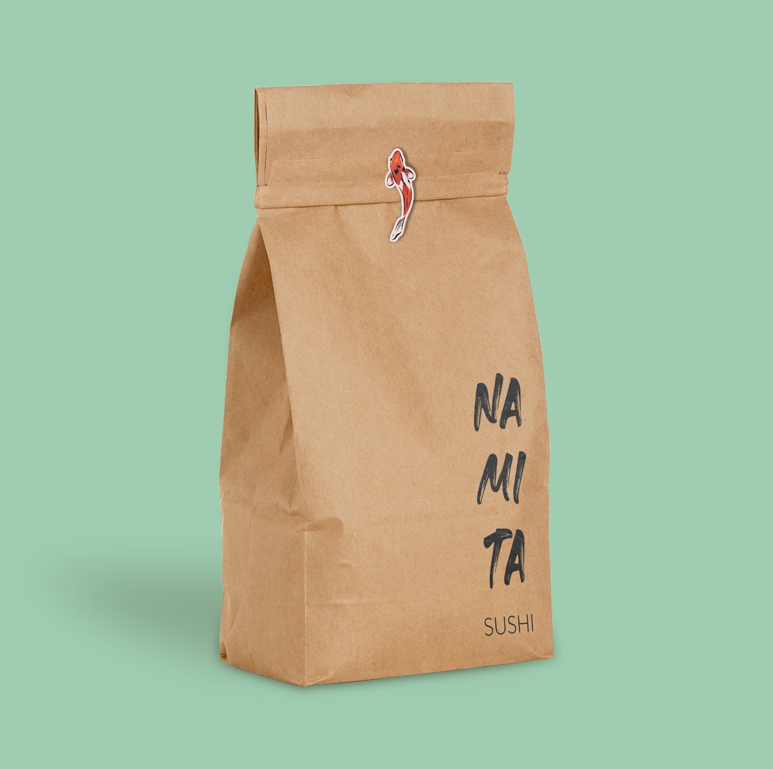
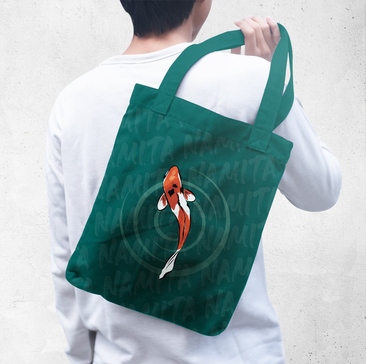
Namita was born as a dark kitchen in Monterrey with the aim of breaking away from the formality of traditional sushi while preserving its excellence. It fuses elegance with a street-inspired edge, creating a minimalist yet vibrant visual identity for an authentic gastronomic experience.
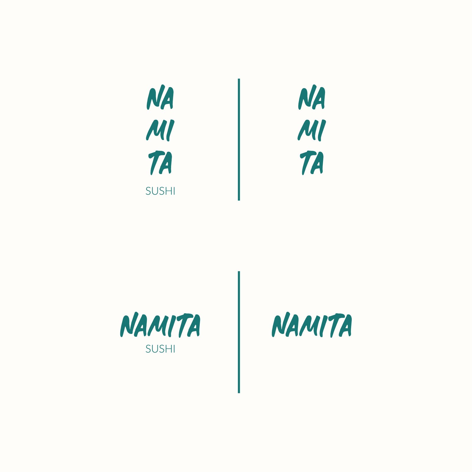
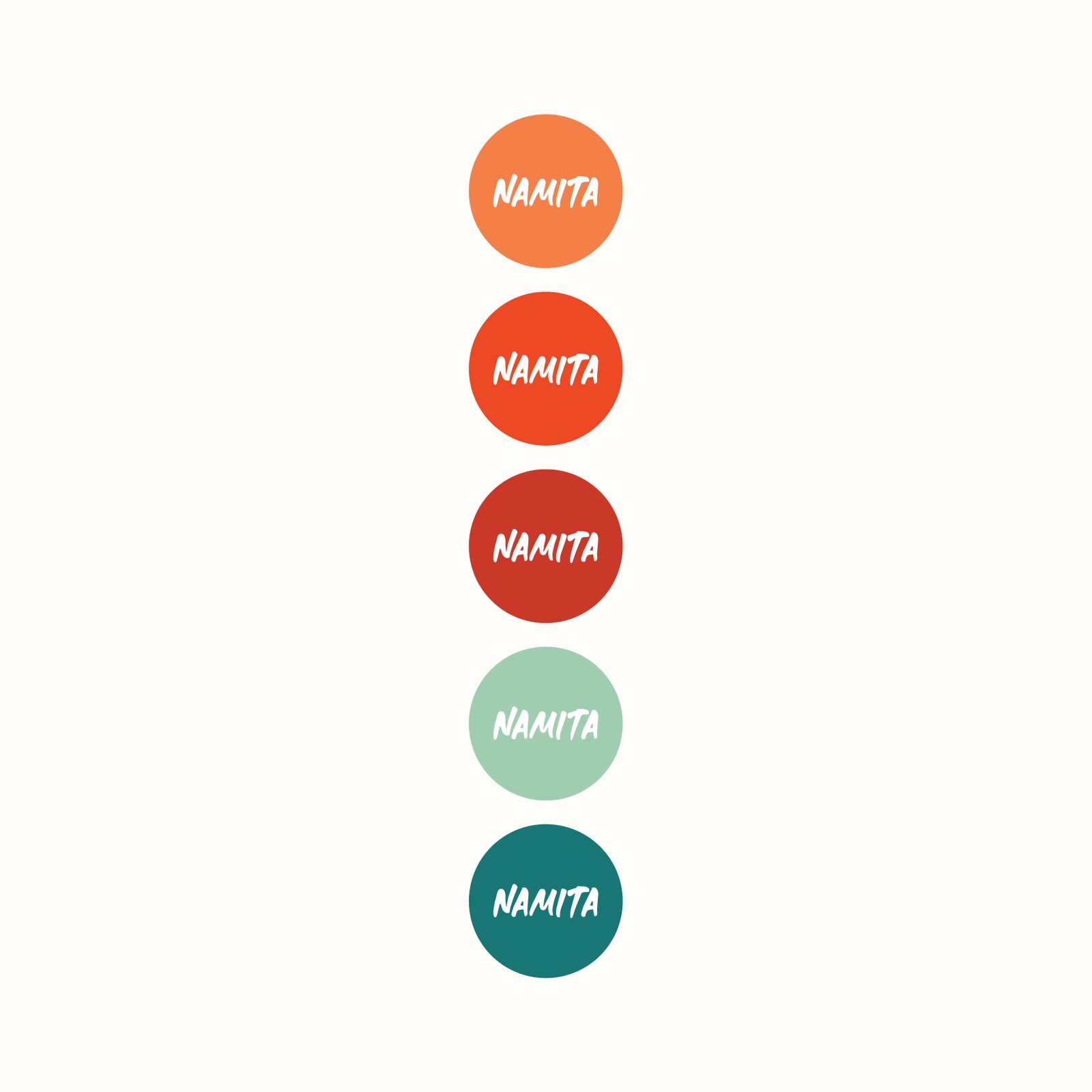
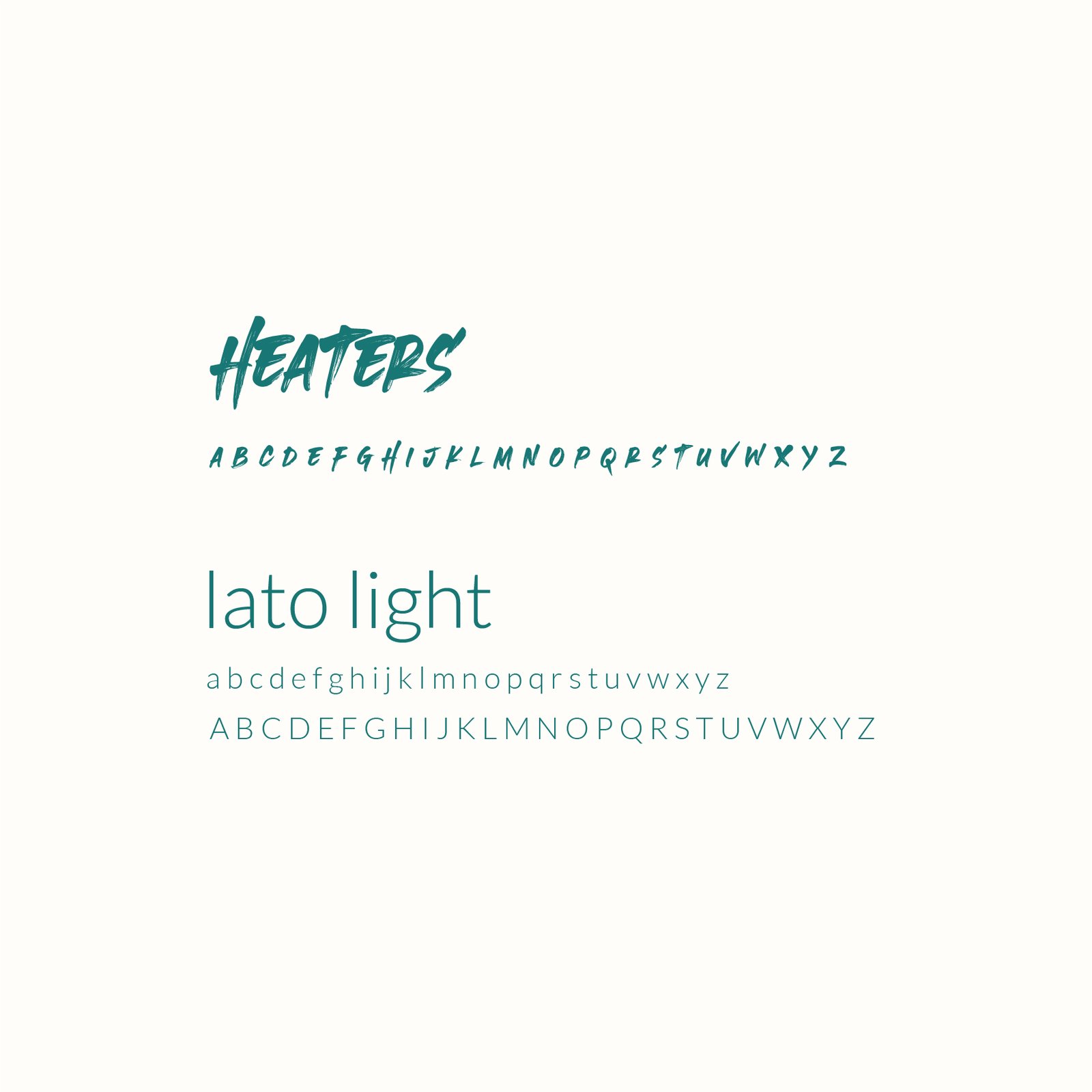
For this project, we developed the brand identity in a comprehensive way: from naming to branding, ensuring that every detail reflected its unique essence. We designed the logo, visual identity, and packaging, creating a balance between minimalism and vibrancy—drawing inspiration from the energy of Tokyo’s streets and the dynamism of Monterrey.
storytelling
the story behind namita
Namita’s design fuses tradition and modernity into an authentic concept. Its name comes from “Nami” (wave of the sea in Japanese) and the diminutive “-ta”, inspired by Mexican phonetics, creating the metaphor of a “small wave”—a nod to its compact yet powerful identity.
This cultural balance is reflected in its visual identity. The koi fish pictogram flowing through waves symbolizes perseverance and transformation, while the Heaters typeface evokes Japanese artistry. The minimalist yet vibrant branding aesthetic reinforces its contemporary and urban character.
Every detail—from the color palette to the packaging—was strategically designed to convey freshness, quality, and innovation. Through its authentic identity and bold design, Namita positions itself as a brand ready to stand out in Monterrey’s competitive food scene.
personality
the soul of namita
Namita is the fusion between the urban and the sophisticated, a balance between tradition and reinvention. Its identity is approachable and authentic, conveying quality without pretension. It is a brand with character, one that respects the essence of sushi while adapting it to a modern and dynamic environment.
Every element—from its image to its gastronomic experience—is designed to connect with those seeking innovation without losing authenticity. Its visual language balances minimalism with vibrancy, reflected in a color palette that mixes neutral tones with bold accents, transmitting freshness, energy, and modernity.