Forno d'oro — naming, branding and visual identity design
intro / concept
naming, branding
& visual identity design
FORNO D’ORO is a pizzeria located in Cartersville, Georgia, inspired by the timeless traditions of Italian cuisine. Built around craftsmanship, hospitality, and a passion for authentic flavors, the brand was conceived to offer more than a meal — creating an experience that celebrates the warmth, culture, and spirit of Italy.
To bring this vision to life, we developed the logo, branding, visual identity, and merchandise for the brand. Every element was carefully designed to balance Italian heritage with contemporary appeal, creating a visual identity that feels authentic, welcoming, and memorable. The result is a brand capable of honoring tradition while connecting with a modern audience, reflecting the distinctive character of FORNO D’ORO in every detail.
To bring this vision to life, we developed the logo, branding, visual identity, and merchandise for the brand. Every element was carefully designed to balance Italian heritage with contemporary appeal, creating a visual identity that feels authentic, welcoming, and memorable. The result is a brand capable of honoring tradition while connecting with a modern audience, reflecting the distinctive character of FORNO D’ORO in every detail.
storytelling
the story behind forno d'oro
FORNO D’ORO was inspired by its most iconic feature: a majestic traditional Italian oven covered in golden mosaics. Inspired by this symbol of craftsmanship and quality, we developed a name capable of conveying authenticity, tradition, and a subtle sense of exclusivity, reflecting the essence of the pizzeria through its verbal identity.
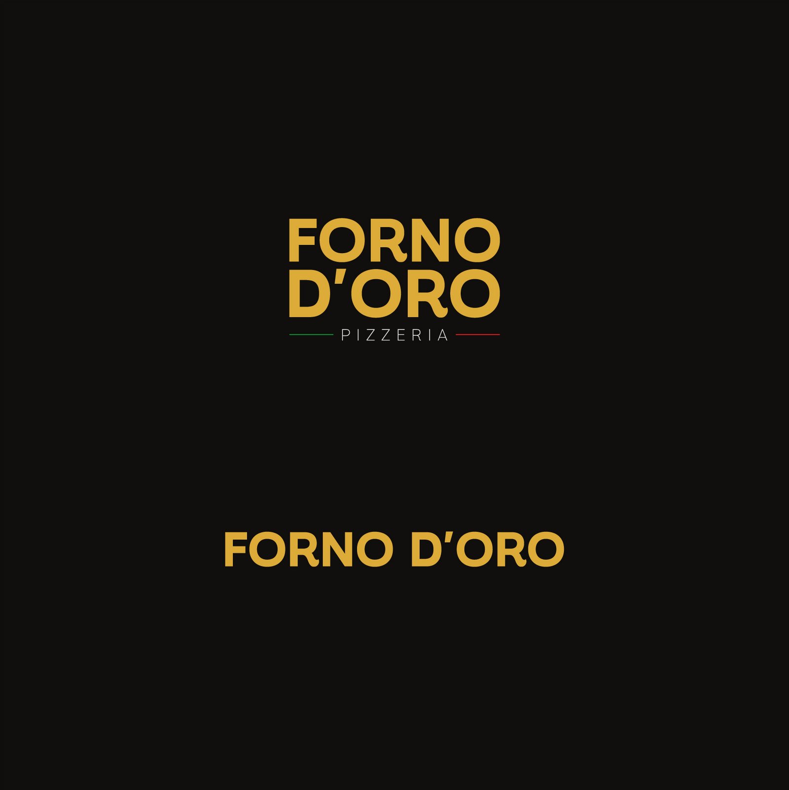
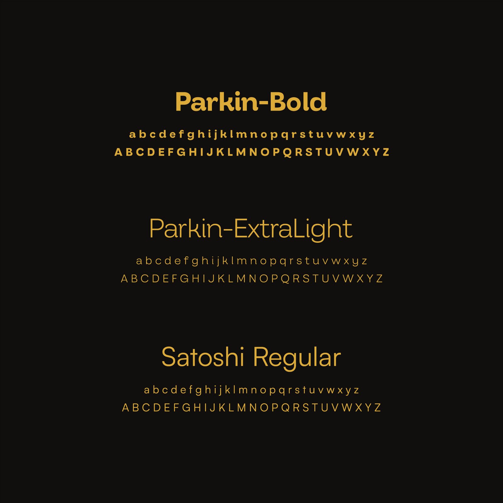
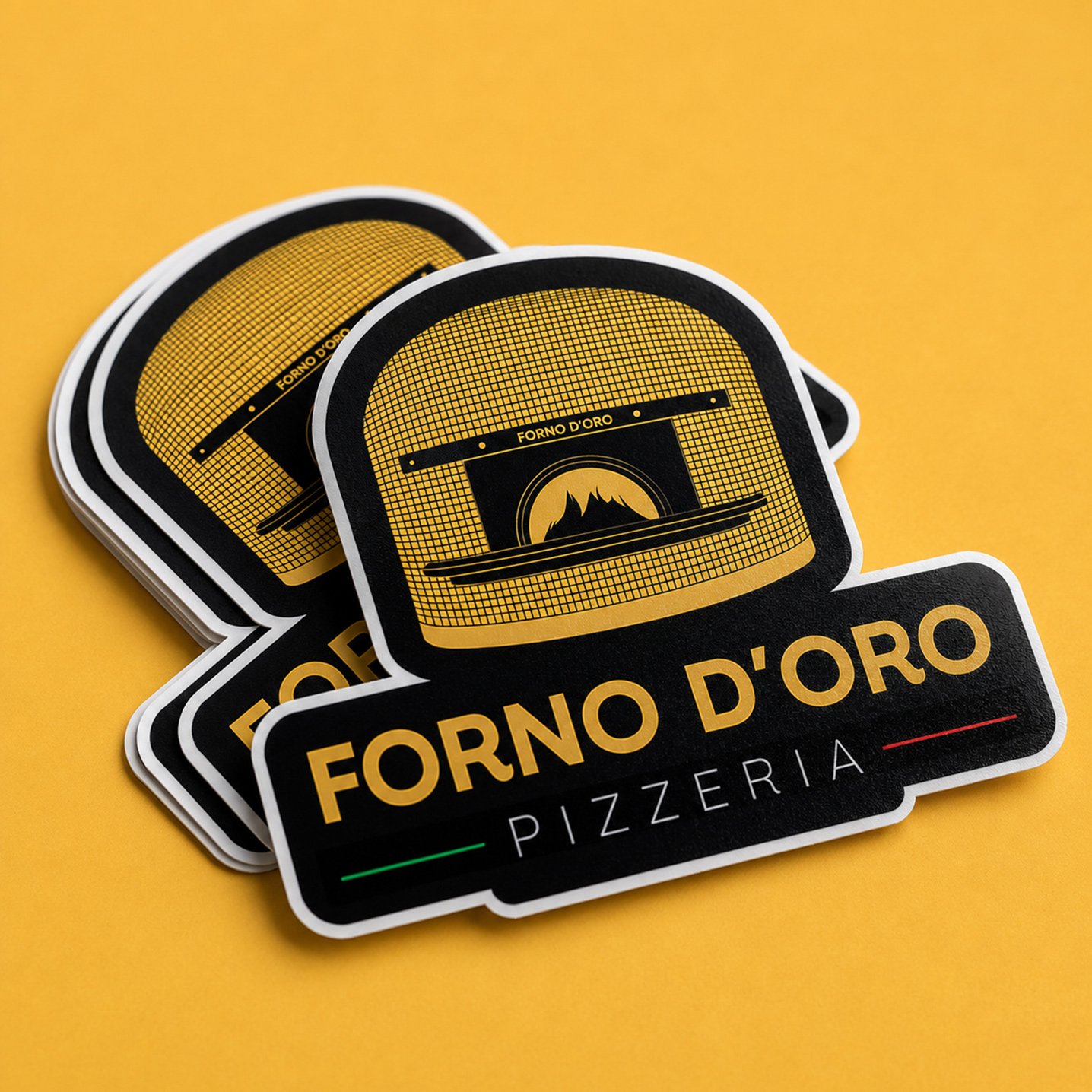
The logo was designed to capture the balance between tradition and contemporary appeal. Its typographic structure conveys strength and confidence, while its clean and balanced composition maintains a timeless character. The use of Parkin Bold and Parkin Extra Light reinforces the brand’s presence with a strong and distinctive personality. The color palette is centered around gold, complemented by the colors of the Italian flag to reinforce the origin and authenticity of the concept.
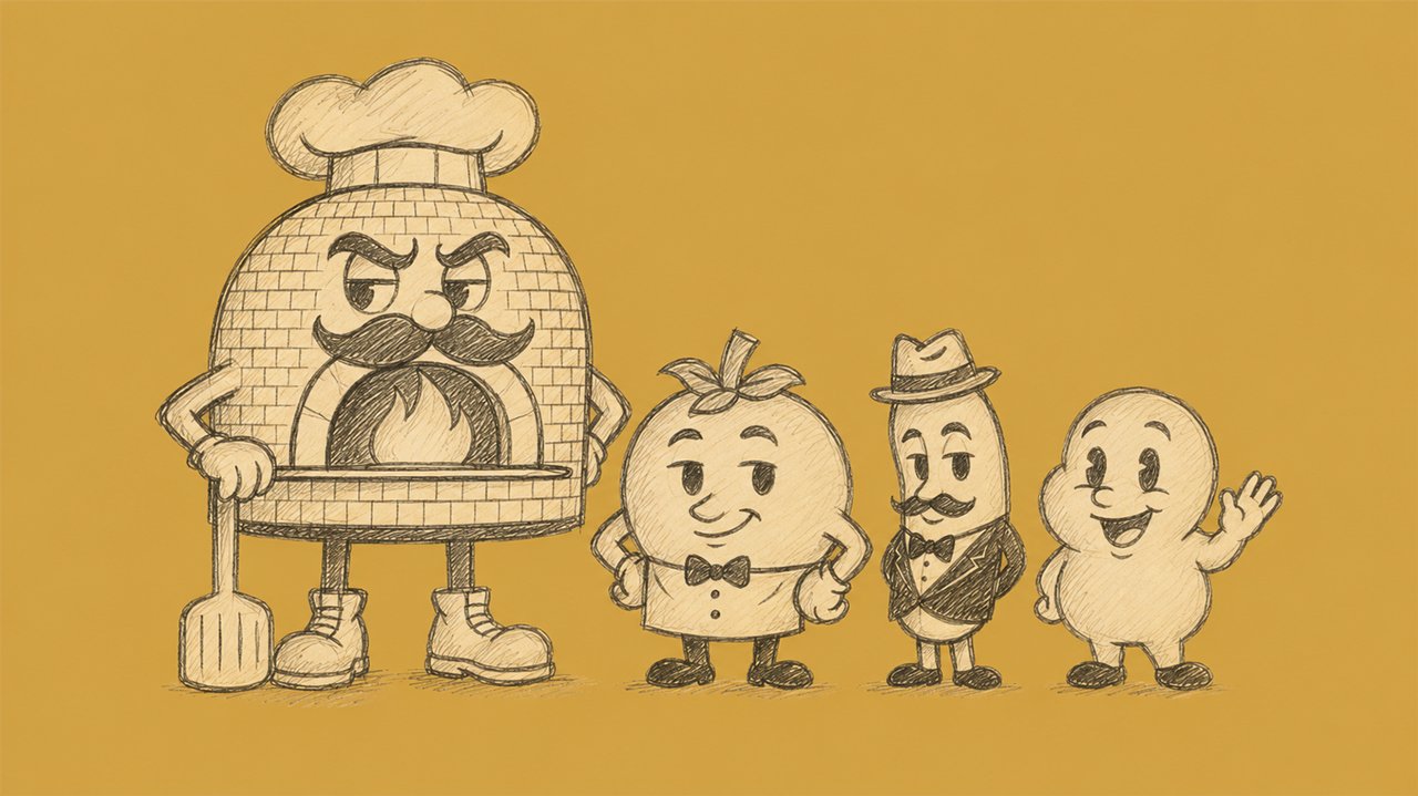
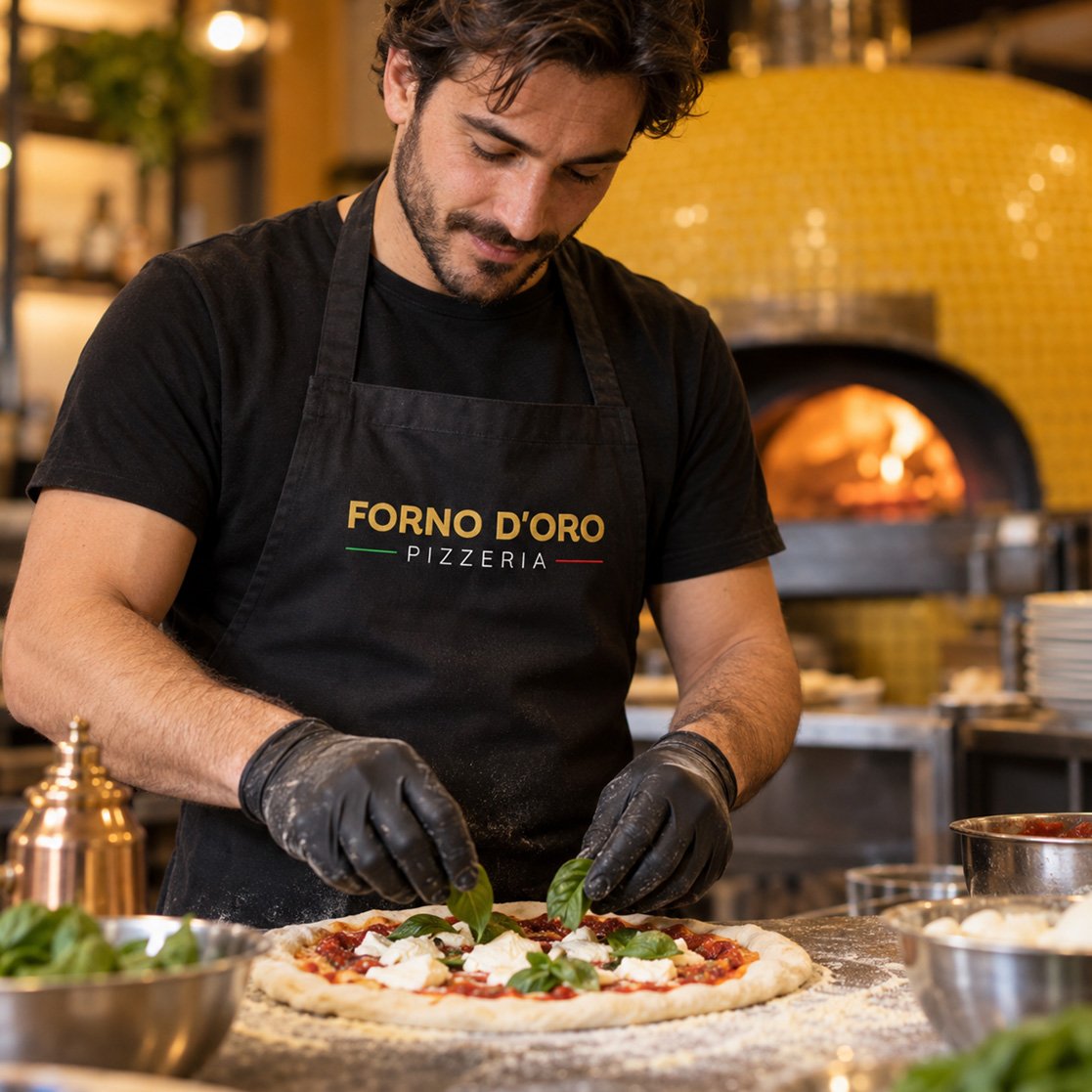
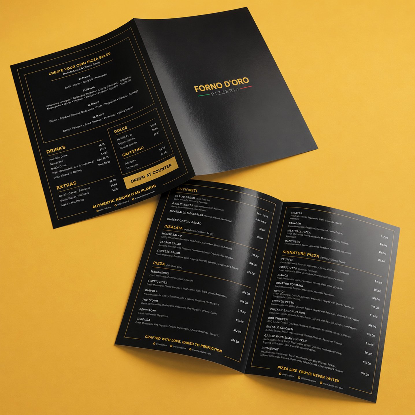
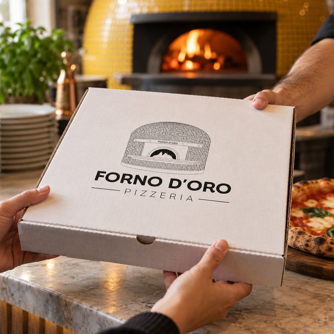
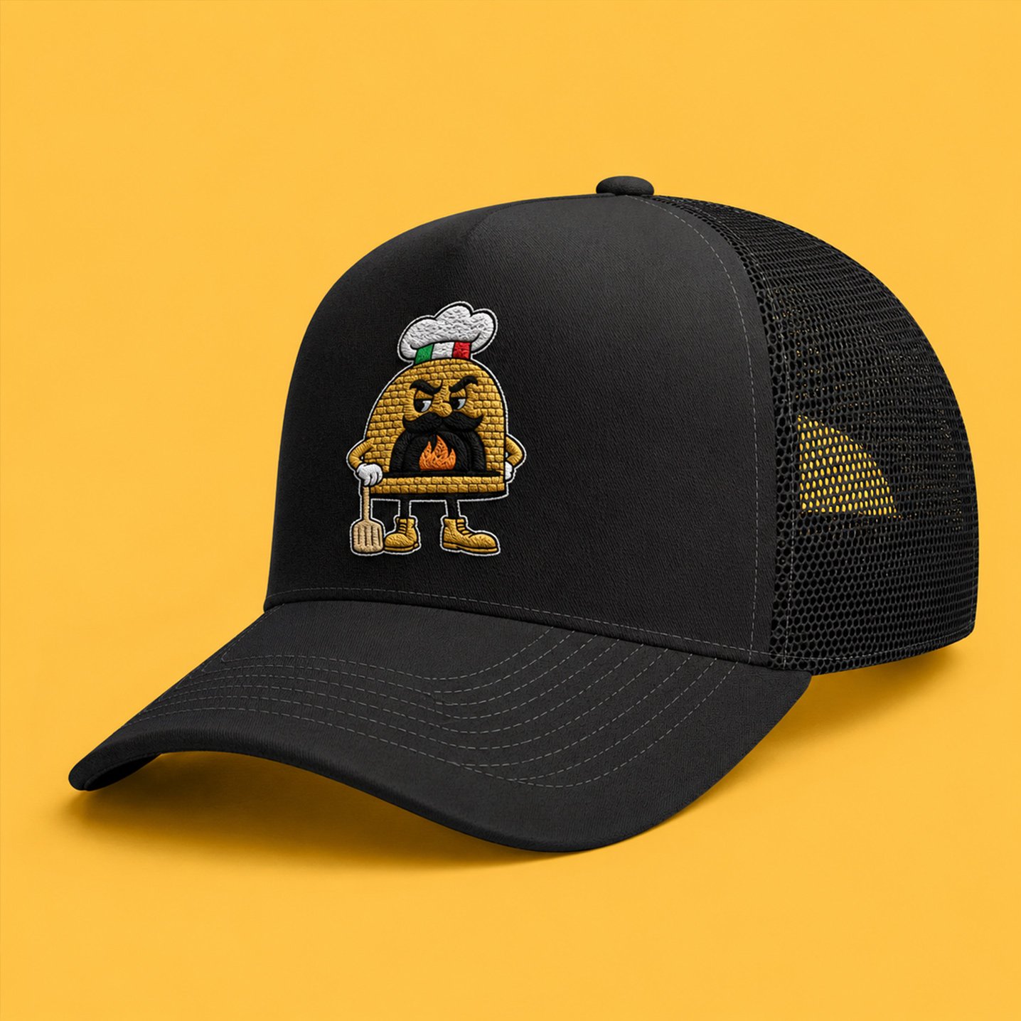
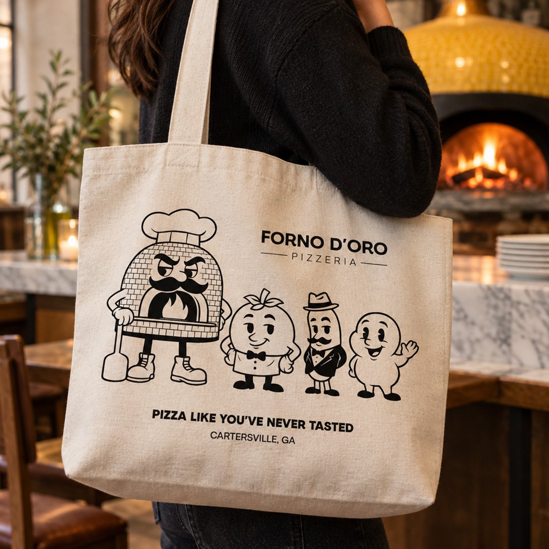
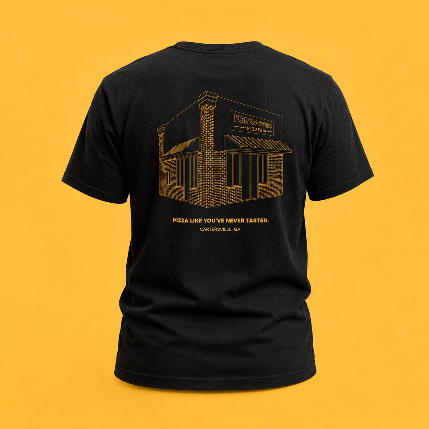
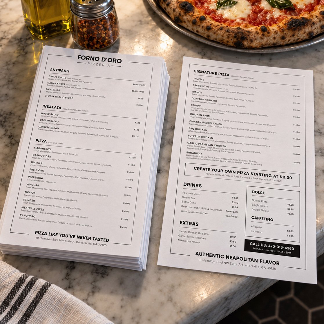
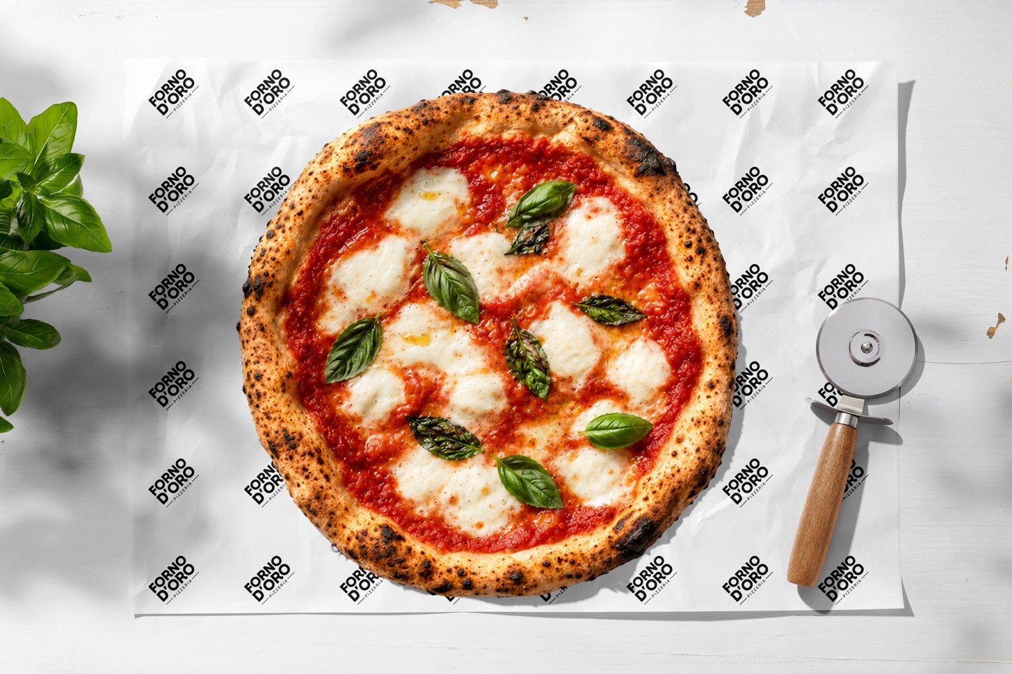
To expand the visual identity, we developed custom illustrations inspired by the golden oven and the building’s façade, applying them across uniforms, merchandise, and visual communication materials. We also designed a graphic system for menus and packaging that preserves the essence of the brand across every touchpoint, creating a visual experience that feels cohesive, memorable, and true to the character of FORNO D’ORO.
The logo was designed to capture the balance between tradition and contemporary appeal. Its typographic structure conveys strength and confidence, while its clean and balanced composition maintains a timeless character. The use of Parkin Bold and Parkin Extra Light reinforces the brand’s presence with a strong and distinctive personality. The color palette is centered around gold, complemented by the colors of the Italian flag to reinforce the origin and authenticity of the concept.
To expand the visual identity, we developed custom illustrations inspired by the golden oven and the building’s façade, applying them across uniforms, merchandise, and visual communication materials. We also designed a graphic system for menus and packaging that preserves the essence of the brand across every touchpoint, creating a visual experience that feels cohesive, memorable, and true to the character of FORNO D’ORO.
personality
the soul of forno d'oro
FORNO D’ORO is a brand that captures the essence of Italian tradition with an authentic and vibrant character. Its identity reflects a passion for Neapolitan pizza in its purest form, celebrating culinary heritage without artifice or pretension.
It is a place for everyone, where guests can enjoy a genuine experience whether they are discovering Neapolitan pizza for the first time or reconnecting with familiar flavors. FORNO D’ORO combines tradition and warmth, maintaining a sophisticated identity that never feels intimidating, but instead welcoming and approachable.
Its visual language highlights gold as a symbol of excellence, complemented by the iconic colors of the Italian flag to reinforce its connection to its roots. The identity balances classic and contemporary elements, creating a brand that feels timeless, memorable, and as familiar as it is inspiring.
It is a place for everyone, where guests can enjoy a genuine experience whether they are discovering Neapolitan pizza for the first time or reconnecting with familiar flavors. FORNO D’ORO combines tradition and warmth, maintaining a sophisticated identity that never feels intimidating, but instead welcoming and approachable.
Its visual language highlights gold as a symbol of excellence, complemented by the iconic colors of the Italian flag to reinforce its connection to its roots. The identity balances classic and contemporary elements, creating a brand that feels timeless, memorable, and as familiar as it is inspiring.
- Tone: Authentic, warm, familiar, approachable, yet full of character.
- Values: Tradition, quality, passion, and hospitality.
- Style: Classic with contemporary touches, elegant without pretension, vibrant, and welcoming.
 EN
EN  ES
ES