La Calle Taquería Urbana — naming, branding and visual identity design
intro / concept
naming, branding & visual identity design
La Calle Taquería Urbana is a food truck in Cartersville, Georgia, that proves roots are never forgotten. More than a simple taco stand, it is the result of a dream turned into reality: a story of perseverance, identity, and passion for authentic Mexican food. Every taco they serve is a tribute to their culture, a celebration of the flavors that define them, and a reminder that no matter the distance, Mexico remains present in every dish and every story shared around the table. Its essence goes beyond gastronomy; it represents the meeting point between Mexican roots and the American dream.
We were entrusted with bringing its visual identity to life, from the creation of the logo and branding to the merchandise and graphic elements featured throughout the food truck. Every detail was designed to convey its essence: a balance between tradition and modernity that captures the vibrant energy of a Mexican taquería on wheels. More than a visual identity, we created a brand experience that transforms every visit into a direct journey to the flavors and streets of Mexico.
storytelling
the story behind la calle taquería urbana
La Calle Taquería Urbana is the fusion of two worlds. On one side, the vibrant essence of Mexican street food: bold flavors, lively streets, and the folklore found in every neighborhood taquería. On the other, the energy of places like Little Havana in Miami, where Latin culture and the American entrepreneurial spirit intertwine. This balance is reflected throughout the visual identity, from the logo to the graphic elements featured across the food truck.
The logo of La Calle Taquería Urbana combines the urban-inspired Daily Shine Regular typeface with stars that evoke the American dream, a direct reference to the iconic signage found throughout Latino neighborhoods in the United States. The color palette — deep red, vibrant yellow, and rich black — captures the essence of the brand: red symbolizes passion for cooking and the fire of the grill; yellow, the hero color of the identity, evokes the warmth of late-night food stands and the glow of streetlights illuminating the streets; while black adds contrast, modernity, and the atmosphere of the night, where the best tacos are enjoyed among laughter and tradition.
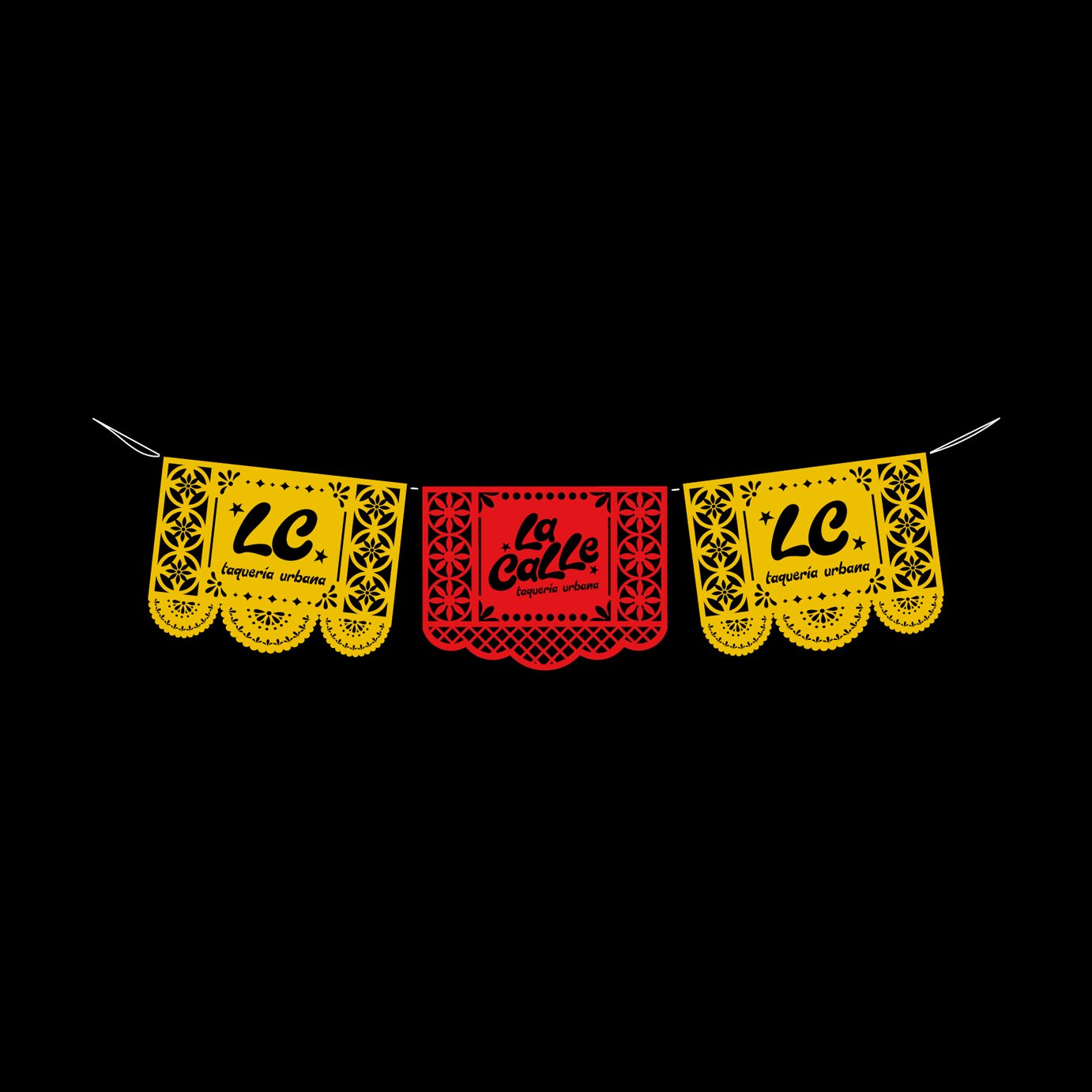
The food truck design extends this narrative through a custom papel picado pattern, transforming it into a moving mural that celebrates Mexican folklore. Every detail, from merchandise to packaging, was designed to reinforce the brand experience. La Calle Taquería Urbana is more than a food truck; it is a symbol of identity and perseverance, a meeting point between Mexico and the United States, where two cultures converge to create something truly unique.
personality
the soul of la calle taquería urbana
La Calle Taquería Urbana is a brand that lives and breathes the essence of the street. Its identity reflects the energy of Latino neighborhoods across the United States and the authenticity of Mexican street food — without pretension, without filters, and without losing its roots. There are no labels or formalities here, just tacos served with flavor, history, and street culture.
It is a place for everyone, where every bite transports people to the corners of Mexico through aromas, laughter, and shared moments. La Calle Taquería Urbana is vibrant, bold, and unapologetically authentic, maintaining an approachable identity that connects with those seeking real experiences.
Tone: Authentic, energetic, unapologetic, and full of character.
Values: Tradition, community, passion, and perseverance.
Style: Street-inspired, urban, spontaneous, and full of life.


 EN
EN  ES
ES